It’s one of those dun days in early April, when the sky is threatening rain and the trees haven’t leafed out yet. In the Meadowlands, the marshes are still a monotony of beige; the surrounding buildings all seem to be made of bleached brick. So it’s something of a shock to walk into the Carlstadt headquarters of Pantone and regard a wall covered in Living Coral, a color so vivid it seems to smack you right in the solar plexus. Pantone’s press materials describe the hue, which the company anointed Color of the Year for 2019, as “an animating and life-affirming coral with a golden undertone that energizes and enlivens with a softer edge.”
Despite the veneer of hype, that sounds about right. Who, after all, can argue about hues with a company that virtually invented the language of color? The Pantone color systems for print, fabric and plastic assign a number and a supporting formulation to each of thousands of shades to ensure exact replication. Design professionals around the world use Pantone’s standards in a host of fields, including publishing, fashion, textiles and paint. Pantone also offers guides that illustrate how the same color might differ on two different surfaces (say, coated versus uncoated paper or cotton versus a metallic fabric).
The operation that would become Pantone began, humbly enough, as a printing shop. It might well have remained one if Lawrence Herbert hadn’t joined the firm in 1956. Like many in the printing trade, Herbert was frustrated by the vagaries of color. He came up with the idea of creating a language of color after seeing the confusion resulting from unclear communication between designer and printer. Herbert also recognized that the appearance of color changed depending on the surface.

A Pantone associate weighs out a mixture of ink in the ink lab. Photo by Fred R. Conrad
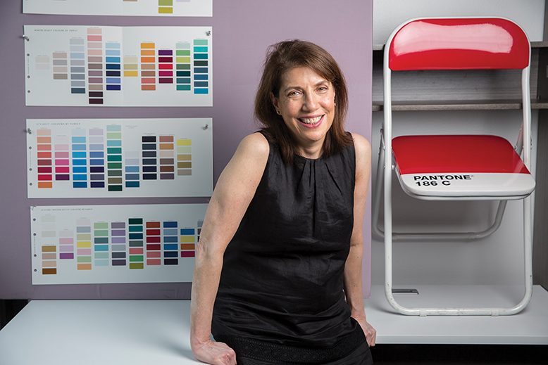
Laurie Pressman, vice president of the Pantone Color Institute (essentially, the consulting arm of the business), recalls the story of a fabric manufacturer whose client mailed him a banana to illustrate the exact shade of yellow for a project. When the package arrived at his office, the manufacturer phoned the client to ask whether she desired the color of the banana when she’d sent it or when he received it.
Whether any of Herbert’s clients approached him with a banana is lost to history, but the anecdote underscores the thinking behind Pantone’s founding. If there were an objective way to “speak” color, Herbert realized—if, for example, when a client said “brick red,” a printer instantly understood the exact shade the client was describing and knew the precise formula to create it—it wouldn’t just avert frustration, but would also save time and money. Herbert proceeded to work up a handful of colors, bought the company in 1962, and set out to convince printers far and wide to accept those colors as a global standard. (Herbert, now retired, was Pantone’s chairman and CEO for more than three decades.)
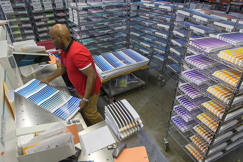
Pantone associate Antonio Smith cuts printed Pantone guide pages. Photo by Fred R. Conrad
It’s a testament to Herbert’s prescience and his abilities as a salesman that Pantone (now owned by Washington, D.C.-based science and technology corporation Danaher) became the world’s preeminent color-matching service, offering some 10,000 unique shades via its famous color books—swatches of color, arranged by hue, that open into user-friendly color fans—and other products.
If that doesn’t strike you as a big deal, consider the role that color plays in businesses as diverse as fashion, food and flag manufacturing. “Brands are recognized by their color,” says Pressman, citing Heinz red, UPS brown, Barbie pink and Tiffany blue, among others. “If consumers see a label that looks wrong, they may consider the product a copy,” she notes. “If the label is on food, they might think it’s past its sale date.” If the color match isn’t exact among the same lavender scarves or midnight-blue dessert bowls displayed together on a store rack (because, say, they were manufactured at two different plants), the consumer may suspect that the items are of inferior quality.
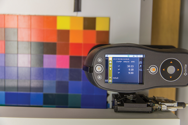
A spectrophotometer checks paper swatches for accuracy. Photo by Fred R. Conrad
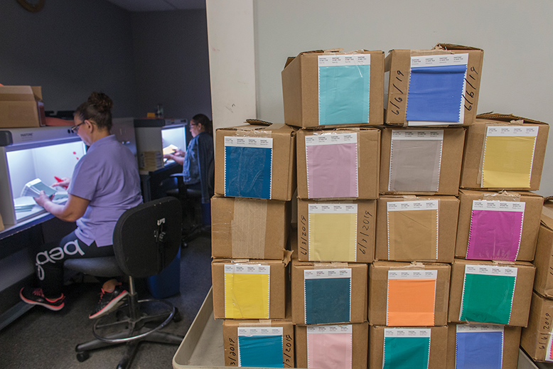
To make sure that Pantone’s colors are pinpoint accurate, the company employs a small army of experts, including textile chemists and digital-color specialists, to maintain quality control. Walk through the Carlstadt facility, and at every turn you’ll find a lab-coat clad, textile-color technician evaluating color in one form or another. Paper color swatches are checked for accuracy under simulated daylight and measured using a highly calibrated device called a spectrophotometer. Fabric colors get similar treatment. After dyeing, cotton swatches are conditioned in a machine that exposes them to light, heat and humidity.
But the company doesn’t just rely on machinery. The human eye—amazingly enough—can sometimes do things that a machine can’t.
“With color measurement, you have a target color and a degree of tolerance around that target, and your sample may measure within that tolerance,” explains Barbara Senatore, Pantone’s color-services manager and senior color specialist. Still, says Senatore, a human with an eye for color may find that supposedly accurate shade unacceptable.
Any Pantone employee who evaluates color is required to pass an annual color-acuity exam known as the Farnswell-Munsell 100 Hue Test, consisting of 88 distinct hues that have to be ordered according to gradations of hue. (To test your own color acuity, take a quick challenge at xrite.com/hue-test.)

Pantone marketing coordinator Cara McIlwaine takes the Farnsworth Munsell 100 Hue Test—an annual requirement for Pantone employees who evaluate colors. Photo by Fred R. Conrad
That insistence on quality control helps to explain why so many businesses, from Liz Claiborne and Lands’ End to Nike and Target, rely on the Pantone Matching System (PMS). It’s why virtually all professional sports teams use the system to ensure the color consistency of their uniforms and brand identities, and why legislatures from Canada to South Korea have passed laws requiring that specific Pantone colors be used in the manufacture of their flags.
Color consulting, in fact, is an important part of Pantone’s business. The company worked with representatives from Keurig to help them devise a new line of colorful pod coffee makers that might entice loyal Keurig-owners to buy a second brewer. And when King Features Syndicate launched a line of products bearing the image of cartoon siren Betty Boop, they came to Pantone for advice on the shade of red (for her dress, garter and signature pout) that would most appeal to contemporary consumers. Some companies come to Pantone not just for pretty colors, but because they’re searching for colors that seduce—and sell.
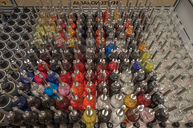
Pantone’s robotic dye machine dispenses precisely formulated colors. Photo by Fred R. Conrad
“We do ongoing consumer color-preference studies,” says Pressman. “Each color has its own unique message and meaning.” It’s no accident, for instance, that brands including Heinz, Coca-Cola, Target, Macy’s, Disney and YouTube use red in their logos. “Reds,” she says, “are consistently positive, consistently about passion.”
And if you want to communicate something other than passion? There’s a color for that. “A palette creates a mood,” Pressman says. “We give the companies we work with the visuals to convey that mood. The base of what we provide to them is the story, the visual inspiration for what the mood means.”
Say, for example, you want to express a mood that’s natural but edgy. You might choose a yellow-based green, which evokes the outdoors but is also, in Pressman’s words, “bold, sharp, trending, artistic and forward.” Bear in mind, though, that the language of color, like language itself, is never static. Twenty years ago, Pressman explains, that fresh, fashion-forward yellow-green might have carried connotations not of the great outdoors, but of seasickness or Shrek.
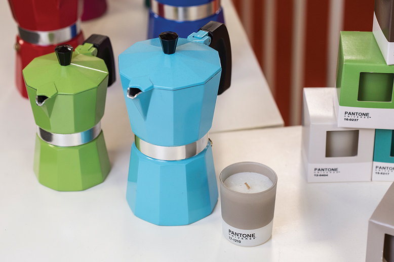
Samples of products created with Pantone colors. Photo by Fred R. Conrad
Pantone’s reputation as the interpreter of color has led to some interesting collaborations. A few years ago, the company came together with the A&E Network to create Bates Motel blue, a vivid, metallic shade used in the TV series Bates Motel, based on the classic Hitchcock film Psycho. And in 2016, Pantone collaborated with the Canadian-based luxury brand Tea Leaves to pair each of the company’s teas with a Pantone color. (Pantone 285C blue, for example, was paired with Organic English Breakfast, and Pantone 7677C purple with Organic Earl Grey with Lavender.)
Pantone also partners on the color-matching side, as it did recently with the Minneapolis-based 3-D printing company Stratasys, which sells the first 3-D printers to offer validated Pantone colors. “It entails really strict quality control from our side,” says Pressman of the licensing agreement with Stratasys. Pantone has similar licenses with manufacturers of laptops, PCs and monitors.
And then there are what might be called unofficial collaborators: the countless creative types worldwide who use Pantone’s colors and color-matching system in their work. Teal Nicholson, a Hunterdon County resident, is creative director at the international event-planning company LLG Events. She turned to PMS after several color mismatches marred the look of events she’d designed. With PMS, she says, “all the vendors for an event, whether they’re working on invitations, linens, or the vinyl wrap for the dance floor, know the exact color we need.”
Pantone associates perform a quality-control check of textile swatches. Photo by Fred R. Conrad
Beyond the worlds of manufacturing and design, Pantone may be best known for its Color of the Year. Since 2000, a team of Pantone color experts has chosen one color annually that appears to embody the cultural zeitgeist. Released with a fair amount of ballyhoo and heralded in major media outlets, including Harper’s Bazaar, House Beautiful, People, Parade, Forbes and CNN, the color coronation is an ingenious marketing device, but Pantone also considers it an educational tool. “Pantone’s Color of the Year helps further the understanding of how trends in color reflect what is taking place in the culture,” says Pressman.
Pressman stresses that Color of the Year isn’t a forecast, but a reflection of trends already in play. In 2016, for example, Pantone chose, for the first time, a pairing of two colors: Serenity (“a cooler, tranquil blue”) and Rose Quartz (“a warmer, embracing rose tone”). They explained the choice as a reaction to a prevailing sense of angst: “As consumers seek mindfulness and well-being as an antidote to modern-day stresses,” wrote Leatrice Eiseman, executive director of the Pantone Color Institute, “welcoming colors that psychologically fulfill our yearning for reassurance and security are becoming more prominent.”
As for Living Coral, it has been reproduced this year on sneakers from Nike and Lululemon, tassel earrings from Kate Spade, Urbanears headphones, Haworth office chairs, and a Vince Camuto jumpsuit. Pressman says the hue reflects a yearning for “humanizing and heartening colors.”
“People are looking for a human touch,” says Pressman, “in a world where things are moving toward automation.” We may shy away from that future today, but if, one of these years, we should start to embrace it, Pantone will no doubt have the perfect color at hand: Robot Rust, anyone?