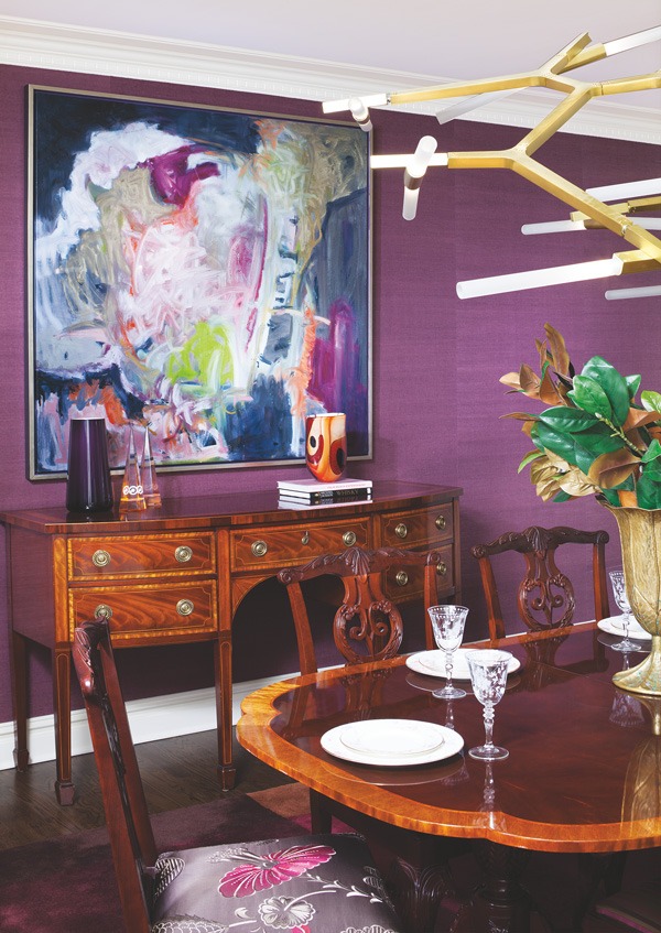
A large modern painting, a bold grass-cloth wallcovering and an abstract contemporary chandelier are among the steps the designer took to balance the traditional feel of this dining room’s Queen Anne-style mahogany table, chairs and server, all of which the homeowners wanted to keep. Photo by John Ferrentino
The layers of dark molding and brown, heavily patterned wallpaper in the foyer were overwhelming, as was a home office with dark green walls. A warren of small rooms, closed off to one another by French doors, was almost suffocating. Furnishings had luxury brand names, but the styles hearkened back to the conspicuous consumption proclivities of the 1980s, even though the home had been professionally redesigned much more recently.
It was serendipitous, then, that the owner of the Essex County home wandered—Starbucks in hand—into a home design store one day during a foray into downtown Livingston. When the store owner, designer Tracey Butler, explained the concept of the business, the homeowner noted coincidentally that she and her husband were considering redoing their primary bathroom.
She invited Butler to visit the home to talk about the bathroom project, and the moment she arrived the ideas started flowing for other rooms also. The homeowner liked the ideas so well that before all was said and done, Butler had redesigned the entire Livingston home as well as the couple’s vacation home in New York state.
At the Livingston house, the owners appreciate dramatic design. The previous designer responded to that mandate with dark walls, traditional furnishings, faux finishes, many mixed patterns, and layers and layers of details. “I proposed creating drama with a lighter, simpler, more modern look,” Butler says. “We started by getting rid of everything except the architectural details, some of the expensive furniture they purchased for the previous redesign and whatever was sentimental. From there, the owners gave me free reign to create a more open floor plan, simpler textures and a lighter palette.”
Any new furnishings had to stand up to the couple’s three children (two were in college and one in high school when the project began) and their friends. “The owners also do a lot of casual entertaining of their own friends and extended family, so it was important to them that everything be comfortable and durable,” says Butler, who has since relocated her design business, b. home interiors, to New York City and launched Clear Home Design, featuring luxury Lucite® and glass home furnishings.
Butler’s first impression of the home came in the foyer, which she found depressingly overdone. “The homeowners are so stylish, so well put together,” Butler says. “This space didn’t reflect who they are.” The owners wanted to keep the applied molding and ceiling trim, so Butler lightened it with cream-colored paint with subtle iridescence. She replaced the dark wallpaper inside the molding with an iridescent wall covering in the same shade as the paint. A light-wood demilune chest with a metallic finish and colorful paintings on the upper walls add more drama. Dark terra cotta tiles with heavy grout lines were replaced with 18-inch crema marfil marble tiles with tight grout lines. “The iridescent and reflective finishes give the foyer sparkle,” Butler says. “The homeowner got the formality and glamour she wanted, but in a much more modern way.”


