


Five years ago, you couldn’t find grey in a New York fabric showroom,” says Lois Caruso, asid, cid, of Lois Caruso Interiors in Little Silver. “Now grey is considered a neutral, in shades from charcoal to dove. This year you will see more pale pinks, muted lavenders, and metallics working wonderfully with greys.”
We asked five leading New Jersey designers for their thoughts on color. The word foremost in their minds was green. Not just the color—though Jennifer Watty of Jennifer Watty Interior Architecture in Westfield comments, “The hottest colors in design for spring are the lime greens in all different tones and textures.” But green in the environmental sense, which is influencing color trends as much as building materials, appliances, textiles, and other aspects of our lives.
“Colors found in nature, such as vibrant yellows, oranges, and greens,” says Suzan Lucas Santiago, asid, cid, director of interior architecture at Newark-based Grad Associates, “are hot because of the availability of more and more green products for our environment. These natural colors reinforce the idea of using sustainable materials. Colors such as khaki, sand, and browns, with neutral floors, wood sisal, and bamboo are very popular right now.”
“With all the focus on our environment,” adds Caruso, “it is only fitting that greens and blues are very much in vogue. Shades of fern, and clear-glass blues mixed with rich chocolate browns and wood tones, keep us aware of our planet even inside our homes.”
There are as many schools of thought on color as there are colors. Some designers will tell you to use color only as an accent in the form of art, flowers and plants, or accessories. Others say that a profusion of color—usually a painted wall—adds drama and warmth. A general rule is that warm colors appear to move toward the viewer, while cool colors appear to recede. Painting a wall red or yellow will make the walls feel closer and the room seem smaller, while a cool tone, such as blue, will help make a room appear larger.
Many other factors come into play, including the style and architecture of a house. Rooms that receive a lot of daylight can handle dark colors, but if a room doesn’t have adequate light, a dark color may make it seem cave-like.
Nature-inspired hues like fern, sage, and aqua make us feel more in tune with the outside world. The Rohm and Haas Paint Quality Institute (paintquality.com) has suggested that green is becoming the latest “neutral.”
“When helping a client select colors, I start by asking questions about the environments and atmospheres that give them positive feelings,” says designer Christine Stout of Designed Metamorphosis in Red Bank. “That could mean anything from where they like to vacation to any surroundings that make them feel peaceful. Next, I take a look at their current home accessories and their wardrobe. Usually I can find one or two colors that prevail to form a pattern.”
“I am excited by the growth I see in consumer color confidence,” says Caruso. “People seem willing to take chances with color.”
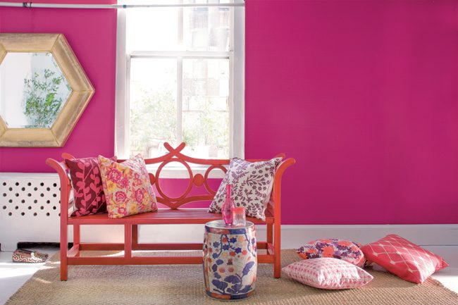
Jeff Acker, president of Acker Bryant Design in Long Branch, also takes an upbeat view. “I believe all colors are exciting right now,” he says. “I have clients that are still comfortable with a palette of neutrals and earth tones, but they will use color in accessories to make a room pop. To define a space, it’s striking to paint one wall in a strong accent color or paint the ceiling a different color.”